
Well I was asked to redesign a Business card for my girlfriends uncle for his business! I made progress and I think the new card I am making is a TON better than the previous design.
So i am going to throw up both for comparison and get your opinion!
here is the old one
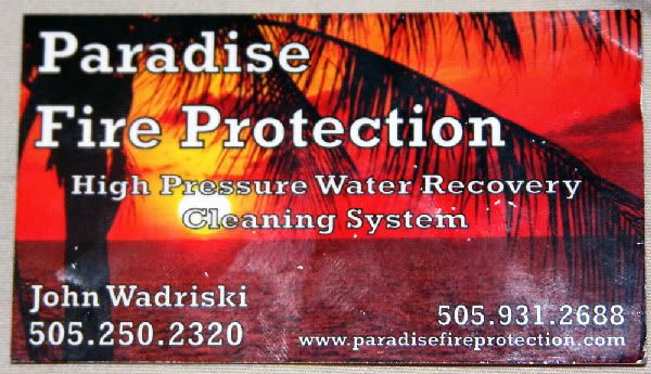
The above card looks just thrown together as to no real though on text placement or anything. Just looks messy
Here is my Redesign Version One

Now I have included more information, Relocated some of the information and chose a different background that to me, represented Paradise. I added more contact info, an address and the company slogan and some history.
Here is my Redesign Version Two

Same as above but added a small black border around design as suggested by Mike93! Looks Better Now!
Now I will let you be the judges and by your comments I will change certain things. If you folks like it as is, then I will leave it be!
Thanks everyone for helping out!
Gabriel
So i am going to throw up both for comparison and get your opinion!
here is the old one
The above card looks just thrown together as to no real though on text placement or anything. Just looks messy
Here is my Redesign Version One
Now I have included more information, Relocated some of the information and chose a different background that to me, represented Paradise. I added more contact info, an address and the company slogan and some history.
Here is my Redesign Version Two
Same as above but added a small black border around design as suggested by Mike93! Looks Better Now!
Now I will let you be the judges and by your comments I will change certain things. If you folks like it as is, then I will leave it be!
Thanks everyone for helping out!
Gabriel